Scout Motors

Project Overview
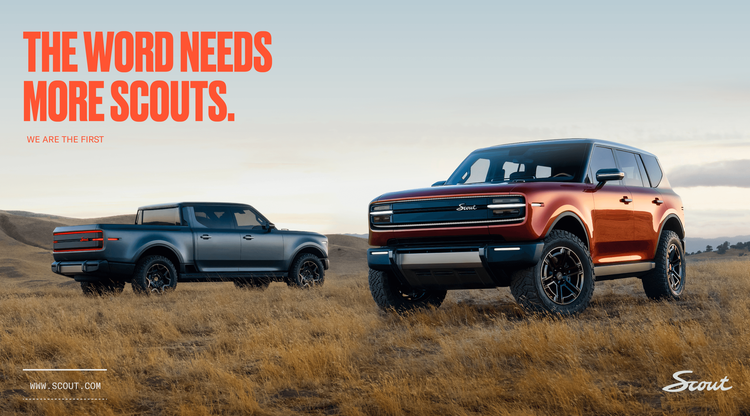
Scout Motors needed a design system that could carry the weight of an iconic American legacy into a modern era — without losing what made it legendary. The visual language was extracted directly from the brand's own DNA: the grille and headlights of the original Scout truck became the foundation for a shape system that feels earned, not invented. The existing "S" logotype was evolved into a standalone symbol, referencing the tradition of Scout badges while giving the brand a mark built for every touchpoint. Typography and color were redefined to balance heritage and ambition — bold type that commands attention, a palette anchored in the original Scout orange and expanded with blues and neutral tones. The result is a cohesive design system that unifies the brand's identity across all applications. Precise, intentional, and built to last.
Industry
Automotive
Category
Design System




Related Projects
03

